

workshop
Sharing the same aim of Happihood Creations, HappiKami is dedicated to cheer up everyone through paper art and recycling workshop.
In 2017, we are also funded by Social Innovation and Entrepreneurship Development Fund (SIE Fund) to develop a systematic course to help Special Educational Needs (SEN) students studying at mainstream school.

Brand Identity Design for
Hello Art Valley

Located in a rural area in Hong Kong, Hello Art Valley is a safe haven where people can enjoy the greens, rest their minds and discover their hidden potentials through carefully curated mind and soul activities. Through healing workshop, arts and craft courses, farming, environmental education and organic meals, Hello Art Valley promises to bring a refreshed soul back to their visitors from hectic life in the concrete city.
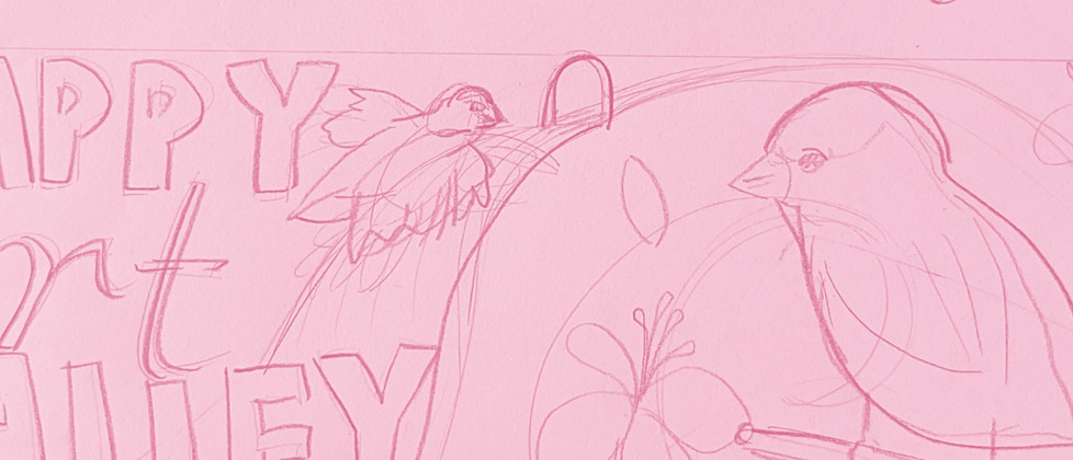
Hello Art Valley values nature and peace, the safe haven believes resting is essential for people to face themselves proactively. When designing the brand identity, a dove is often used to symbolise hope, peace and mission. Unlike other brands which use dove as well, the dove is sitting and resting serenely in Hello Art Valley's logo, its surrounding graphic elements represents nature to enjoy with. The whole brand uses light and bright colours to convey a feeling of happiness. Lastly, a tag line "Discover to fly higher" is often used as the background to emphasise the value of Hello Art Valley.
Project: Brand Identity Design for Hello Art Valley
Client: Hello Art Valley by PHES
Year: 2021
Creative Director: Jola Happihood
Designer: Purple Wan


The Dream Wall
Happy Art Valley is partly surrounded by the "dream wall" which offer visitors to write their burdens, dreams and love notes on.
Through discharging negative thoughts and nourishing love notes, what could stop you from pursuing your dreams?

Theme: burden discharge negative thoughts

Theme: Love Notes

Theme: Dream Fly Higher

Theme: burden discharge negative thoughts


